
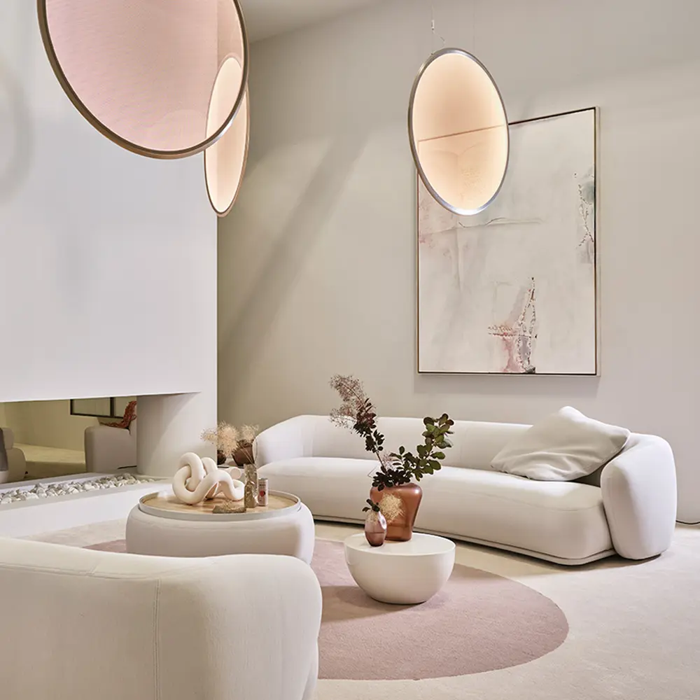
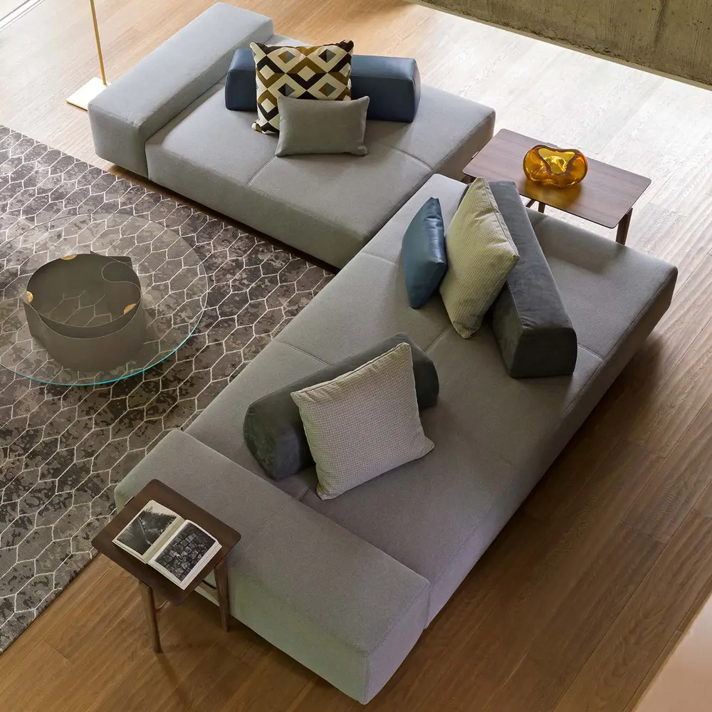
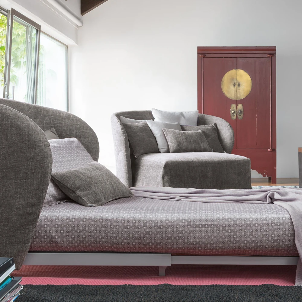
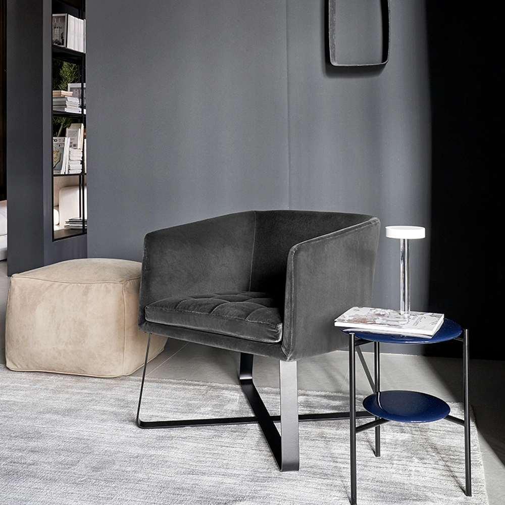


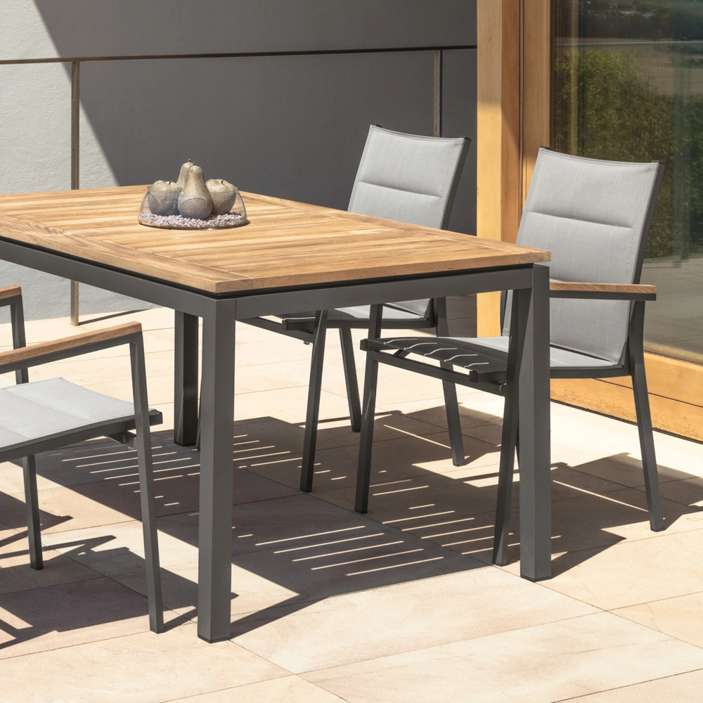
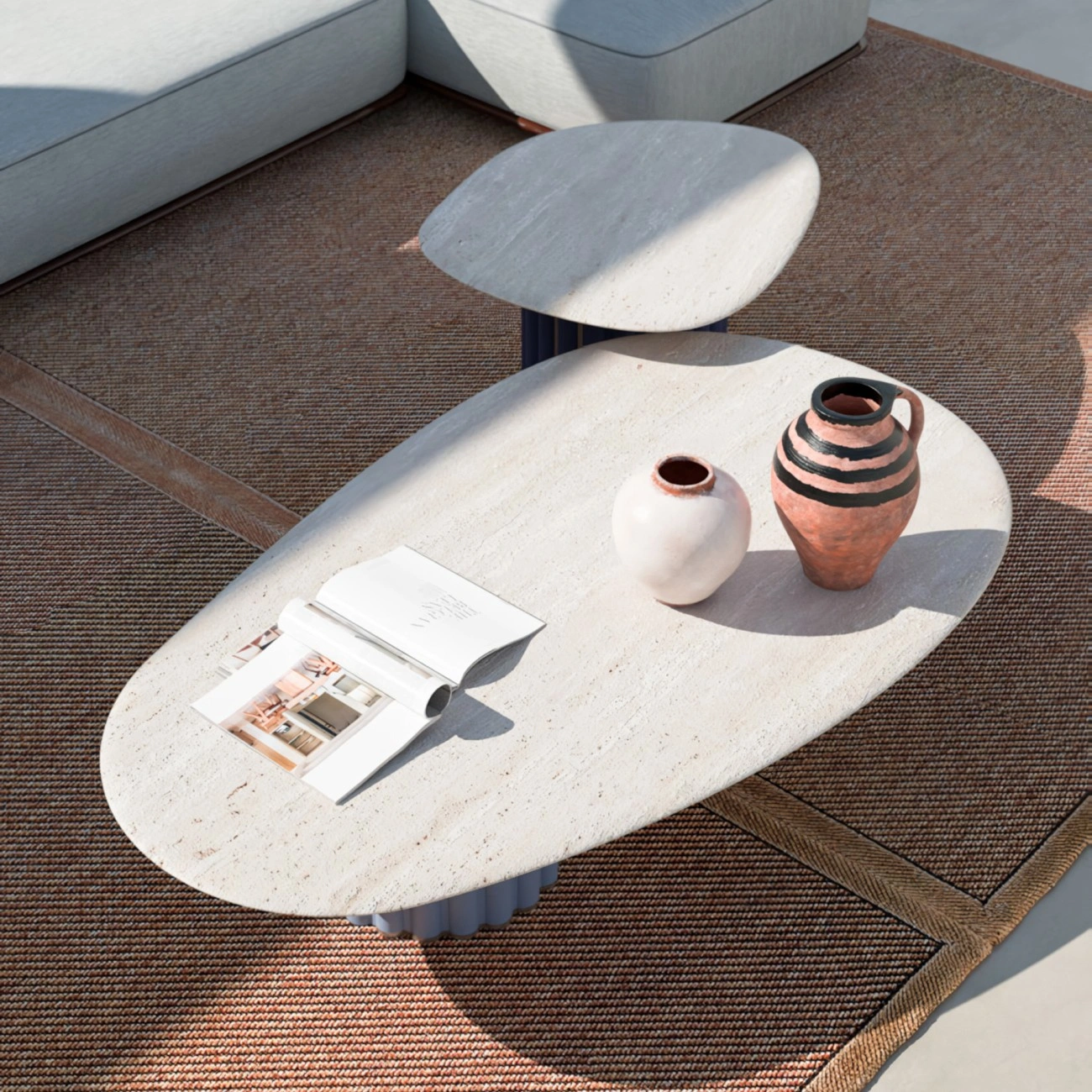


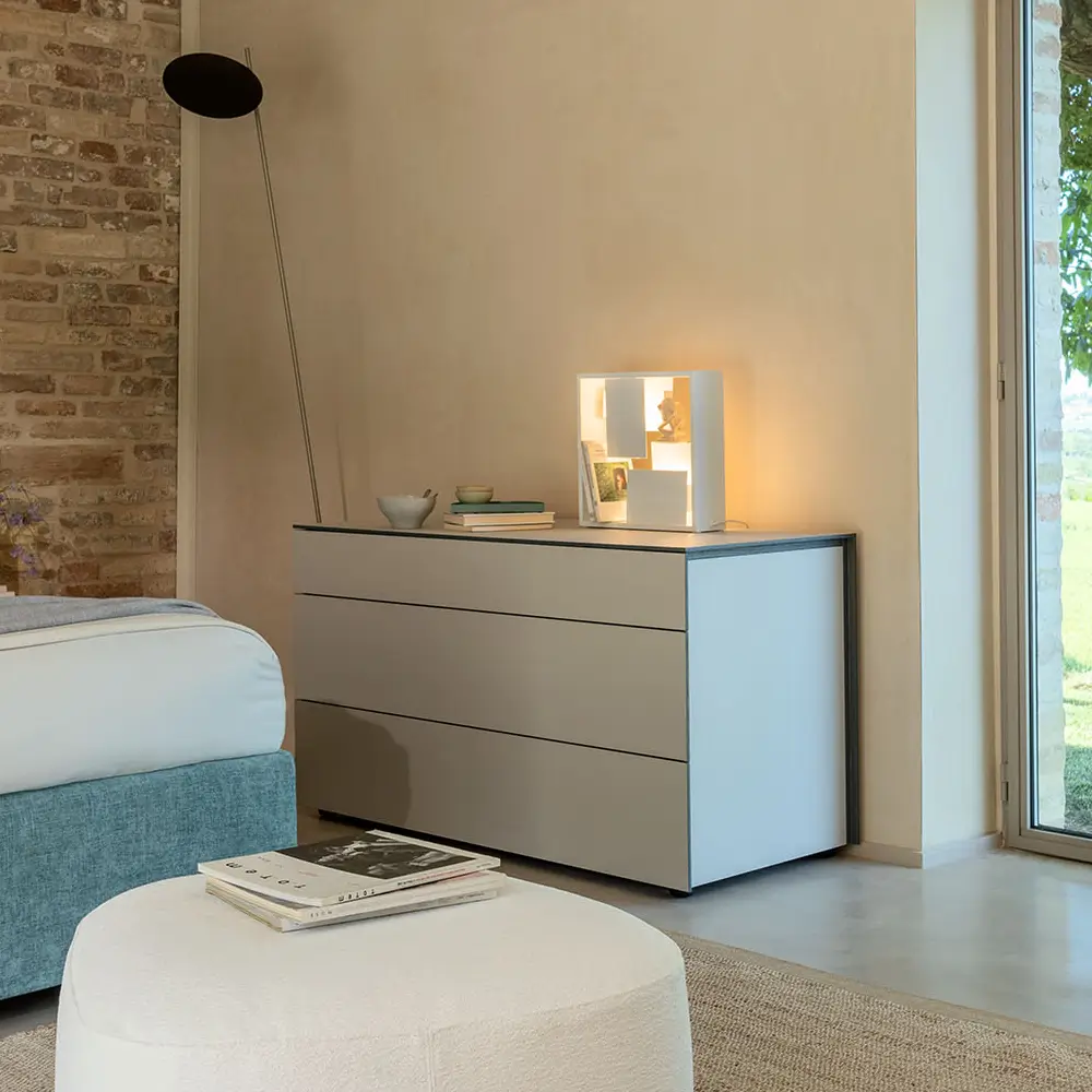
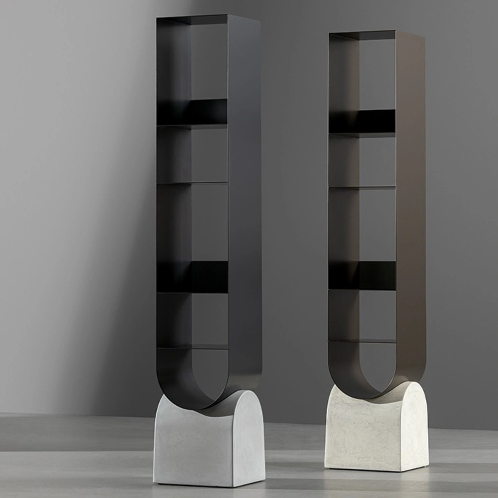
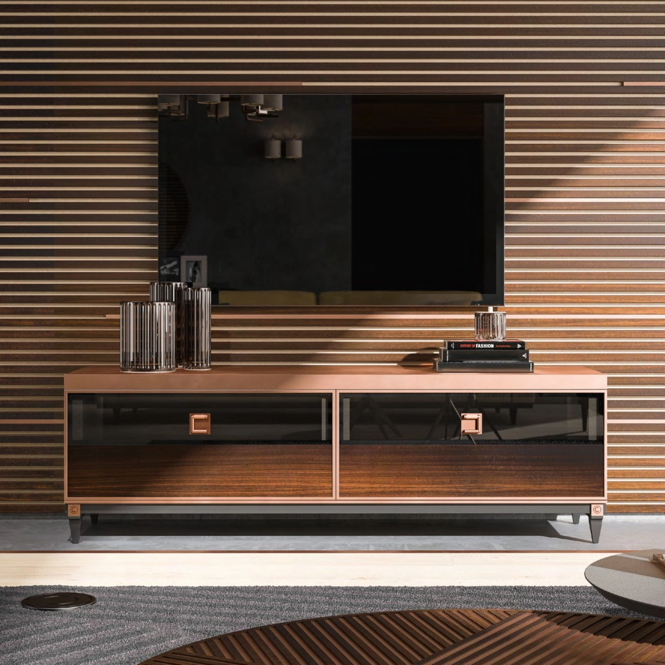

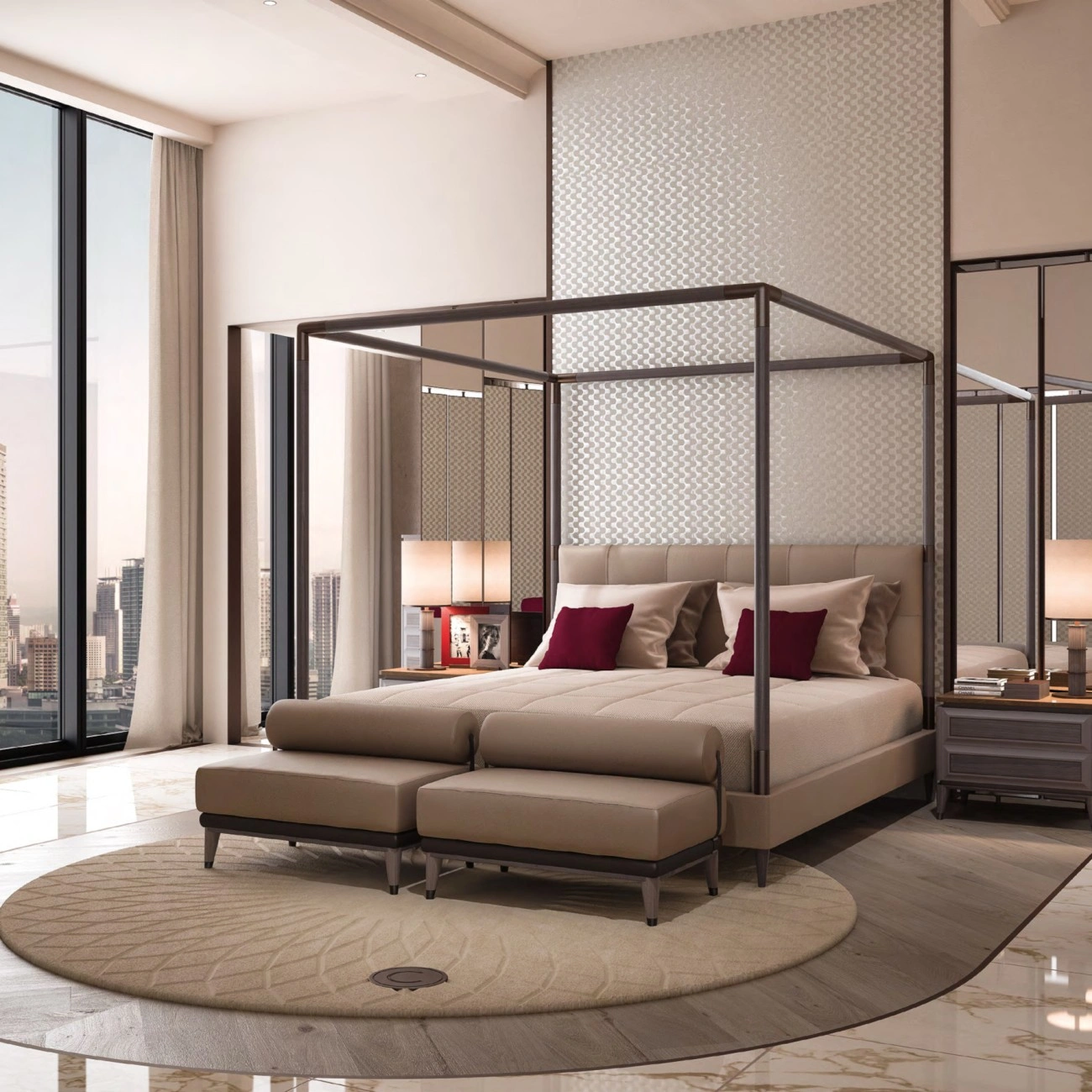







Orange is the colour interiors keep swearing off. It carries more baggage than any other hue on the wheel — 1970s kitchens, fast-food signage, the specific shade of pine that ruined a decade of flooring — and every time it returns it has to be reintroduced under a different name.
This time the names are terracotta and tangerine, and the return is real. It is the clearest single movement inside the 2027 colour forecasts, and unlike most forecast colours it has an obvious reason for existing.
Why orange, and why now
Colour cycles in interiors are mostly reactions to the previous cycle. The last one was long and unusually monochrome: a decade of grey, then greige, then a warm-white correction that quietly turned into its own kind of blankness. By the end of it a great many rooms had been drained of hue entirely and were relying on texture to do all the work.
Earthy orange is the shortest route out of that. It is warm without being sweet, it is derived from materials people already accept — clay, rust, unglazed pottery, sunburnt plaster — and it reads as natural rather than decorative, which is the permission structure the whole earth-tone family has been operating under. It belongs to the same broad shift toward warm, material-derived colour that we set out across every room in our guide to 2027 interior colour palettes.
The important thing is that this is not one colour. It is three, and they behave very differently.
The three oranges
Terracotta — the structural one
Muted, brown-shifted, low in chroma. Terracotta is the only one of the three that can safely take a large surface: a whole wall, a floor, a full upholstered sofa. It behaves less like a colour and more like a neutral with a temperature, which is why it survives in rooms people actually live in rather than only in photographs.
The test for a good terracotta is whether it still looks like earth under artificial light at night. Cheaper versions go pink after dark. The ones worth using hold their brown.
Tangerine — the accent
Clean, high-chroma, considerably more saturated. Tangerine cannot hold a room and should not be asked to. Its job is to be the one loud thing: a lacquered side table, a single armchair, a stack of ceramics, a lamp base. In a scheme otherwise built from plaster and wood, one tangerine object does more than any amount of careful mid-tone layering.
Used at scale it turns institutional almost immediately. Used once, it is the reason the room is memorable.
Ochre and amber — the bridge
The yellow-shifted middle ground, and the most useful of the three in practice because it connects the other two to wood. Ochre in a textile — a linen curtain, a wool throw, a rug ground — is what stops a terracotta room and a tangerine object from looking like two unrelated decisions.
What to put next to it
This is where most orange schemes fail, and the failures are predictable.
- Olive and deep green. The strongest pairing available, and not a coincidence — the two sit near-opposite each other and share the same dusty, earth-derived quality. An olive green sofa with terracotta and ochre textiles is very close to a default scheme for this style, and it is the pairing that has driven most of the interest in both colours at once.
- Warm off-white, never cool white. A blue-white wall next to terracotta makes the terracotta look dirty. Plaster whites, bone, chalk and the warmer greys work; anything with blue in it does not.
- Walnut and mid-brown timber. Reliable, because the wood carries the same undertone. Pale ash and birch are harder — they push orange toward the 1970s reading faster than anything else.
- A genuine near-black. Blackened metal, dark stone, a very dark joinery run. Without it the room has no anchor and the whole palette floats.
- Not navy. The most common instinct and the least successful. Navy and terracotta are both mid-depth and both assertive; together they compete rather than settle.
How much, and where
The old 60/30/10 rule is not quite right for this palette, because terracotta is doing neutral duty rather than accent duty. A more useful division is something like seventy percent warm neutral, twenty percent terracotta or ochre in a genuinely large element, and ten percent split between the deep anchor tone and a single high-chroma tangerine object.
Where to spend the twenty percent depends almost entirely on how long you intend to live with it:
- Walls are the cheapest and the most reversible, and the least interesting. A terracotta wall in a flat emulsion is the version of this palette that will look tired first.
- Upholstery is the version that actually works, because the colour arrives with texture attached. Bouclé, brushed cotton and heavy linen all shift terracotta several degrees toward material and away from paint.
- Floors and hard surfaces — cotto tile, unglazed terracotta, warm stone — are the most permanent and by some distance the most convincing, since the colour is inherent rather than applied.
- Small objects are where tangerine lives, and the only place it should.
If the decision in question is a sofa specifically — the largest single colour commitment in most rooms — it is worth reading this against the wider movement in sofa colour trends before committing, because a sofa outlives a palette by roughly a decade.
Paint, and its limits
Every year produces a set of orange-adjacent colour-of-the-year announcements and every year the same problem appears: flat paint is the worst possible carrier for this family. Earthy orange depends on the light breaking unevenly across a surface. On a flat wall it has nowhere to break, and what should read as clay reads as a colour swatch enlarged.
Three fixes, in ascending order of expense: use a limewash or clay-based paint rather than a modern emulsion; put the colour on something with a nap rather than on a wall; or use a genuinely textured plaster and let the material supply both the colour and the variation. This is the same argument for building interiors around touch rather than image — a palette this dependent on surface behaviour cannot be chosen from a screen.
Where it comes from
Worth noting that none of this is new. The terracotta-and-ochre scheme with olive and blackened iron is essentially a Mediterranean vernacular palette, arrived at over several centuries because those were the pigments and materials available within a short cart ride. It is the same palette driving the current Tuscan revival, and the reason both trends surfaced in the same eighteen months is that they are, materially, the same trend described twice.
Which is a reasonable argument for its durability. Palettes invented by a forecasting agency have a five-year life. Palettes that derive from what the ground actually produces tend to keep coming back.
The short version
Terracotta on something large and textured. Ochre in the textiles to bridge it to the wood. Tangerine exactly once. Olive or deep green opposite it, a warm off-white behind it, and one genuinely dark element to hold the floor. Avoid flat paint and avoid navy.
That is the whole palette. For how it sits against the other directions moving through 2027 — the greens, the deep browns, the recovered mid-tones — and for room-by-room combinations, the full guide to 2027 interior colour palettes is the place to go next.