


Pantone’s 2025 Color of the Year, Mocha Mousse, hinted at something bigger: a craving for comfort and connection. By 2026, that craving isn’t subtle anymore. According to Pantone 2026, palettes feel earthy, warm, and a little more lived-in. Grey walls, the ones that dominated for years, are quietly fading. Taupes, soft clay tones, mellow beiges—they don’t scream, they just hold you.
Furniture, art, and textiles suddenly feel part of the conversation rather than just decoration. A custom rattan chair catches the light differently against a mocha-toned wall. Terracotta pots on a reclaimed wood console don’t just sit there—they belong. Mocha Mousse may have started the trend, but 2026 color feels like it’s telling a story.

Greens That Ground
Muted greens are stepping forward now—sage, eucalyptus, dusty jade. Not screaming emeralds or neon—soft, contemplative tones that calm the eye. Benjamin Moore, Sherwin-Williams, Valspar—brands are all leaning in. People want interiors that feel restorative, not just visually neat.
Green isn’t just paint. Upholstery, ceramics, pillows—they all pick up the mood. Rooms begin to feel human, tactile, intentional. Pantone seems to get it: the emotional pull of color matters more than just the look.
Jewel-Toned Anchors
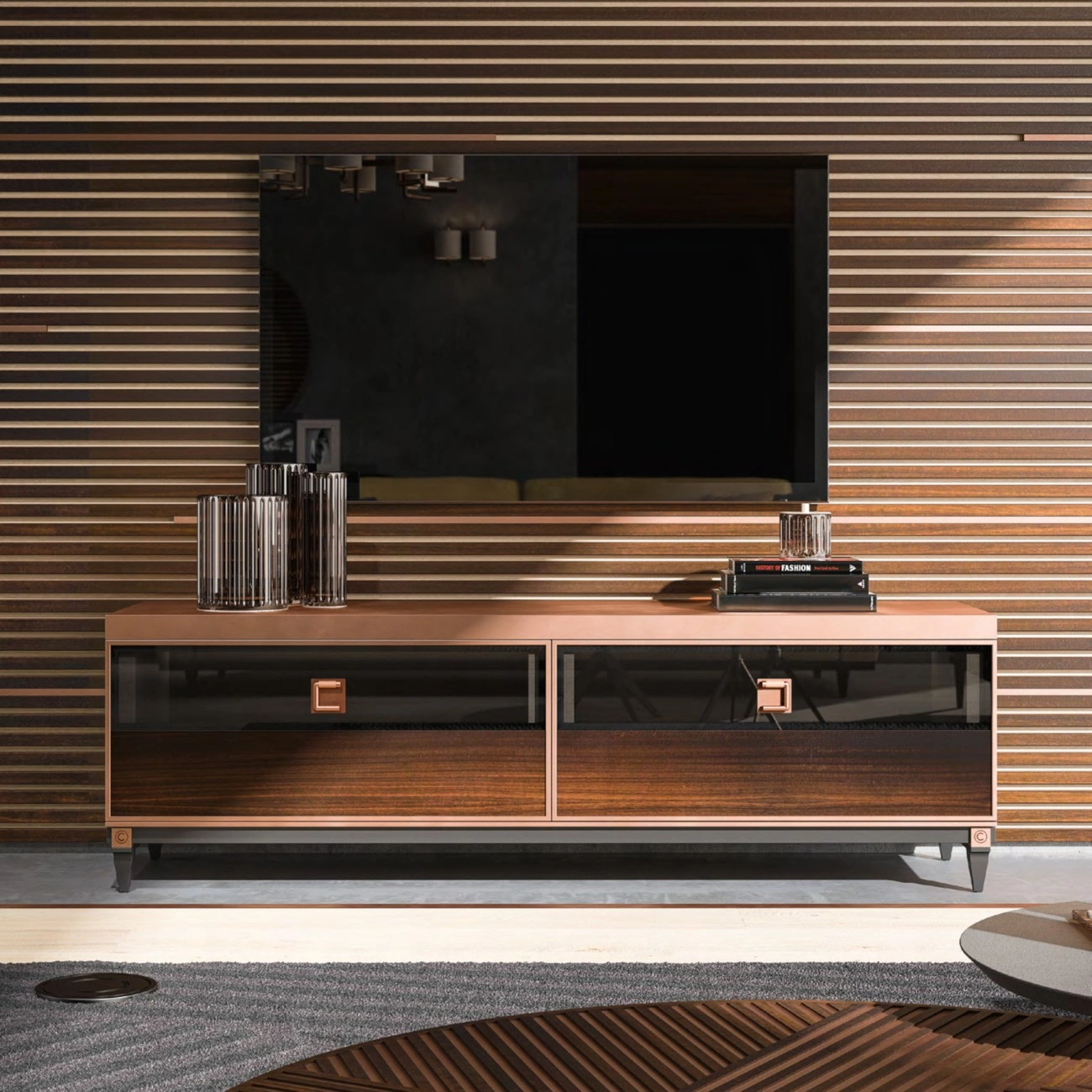
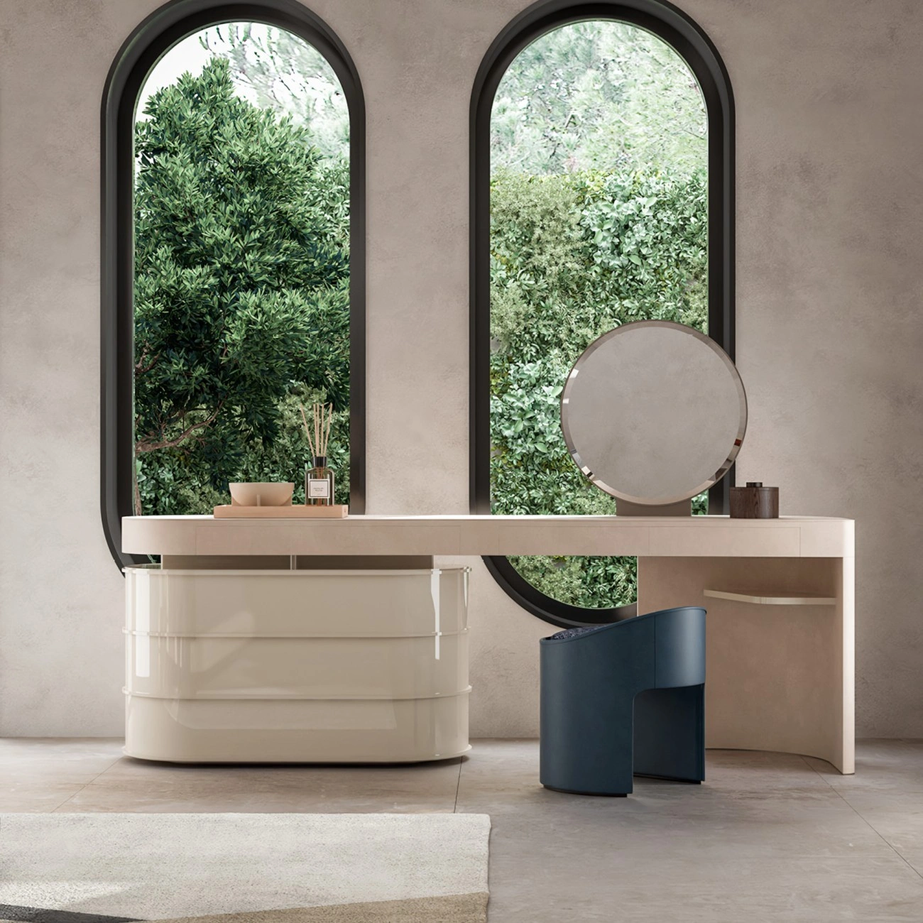
Alongside neutrals and muted greens, vintage-inspired jewel tones are creeping back. Deep teal, navy, terracotta, mellow ochre. They add depth but don’t scream for attention. Velvet chairs, ceramic lamps, a throw here or there. It’s personality, yes, but subtle.
Layering is key. Teal next to sage, terracotta on a wooden table. Surprising, but it feels thought-out rather than catalog-staged. That’s what separates a lived-in home from a showroom.
Comfort-Forward Schemes
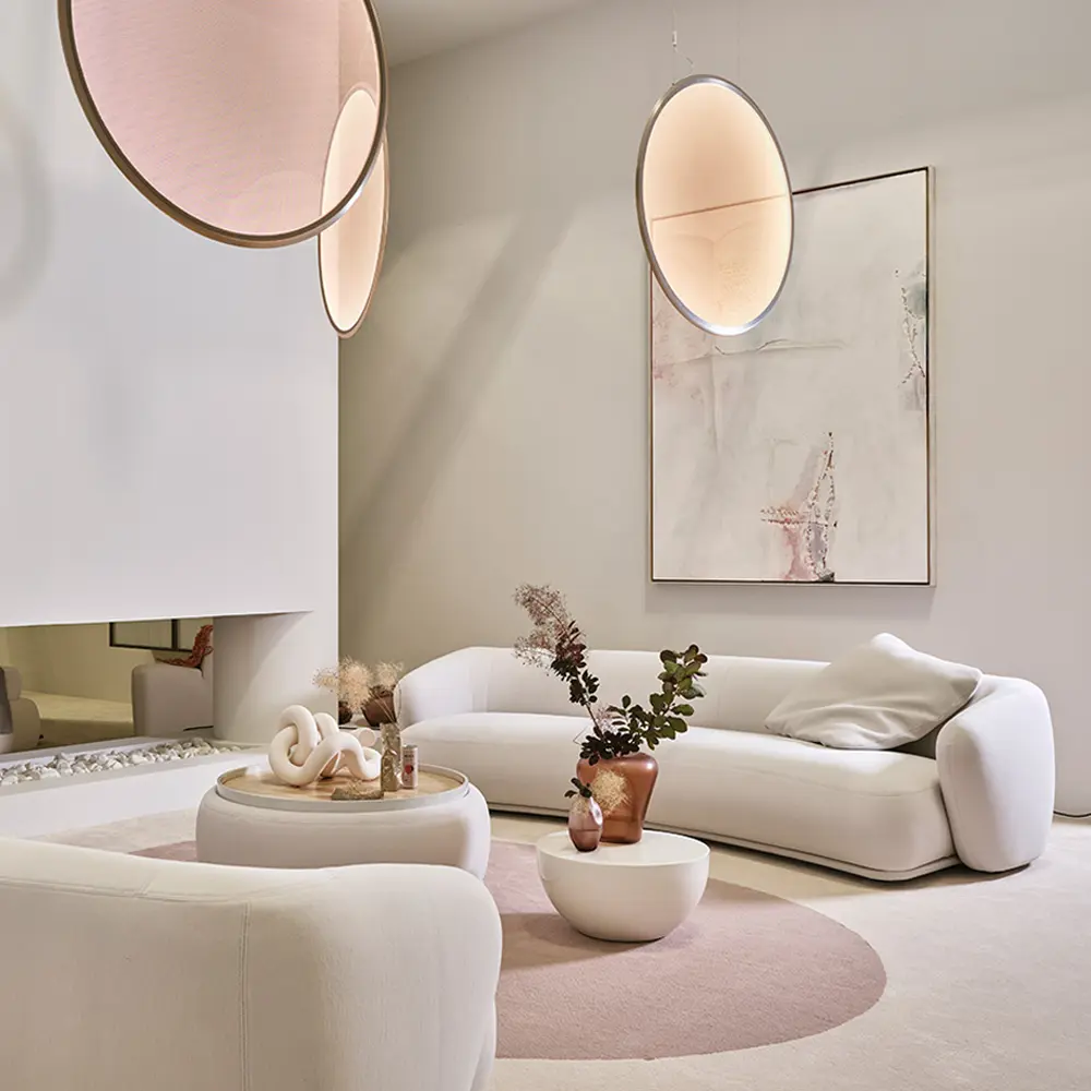
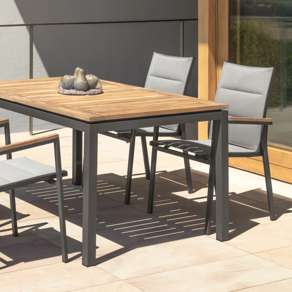
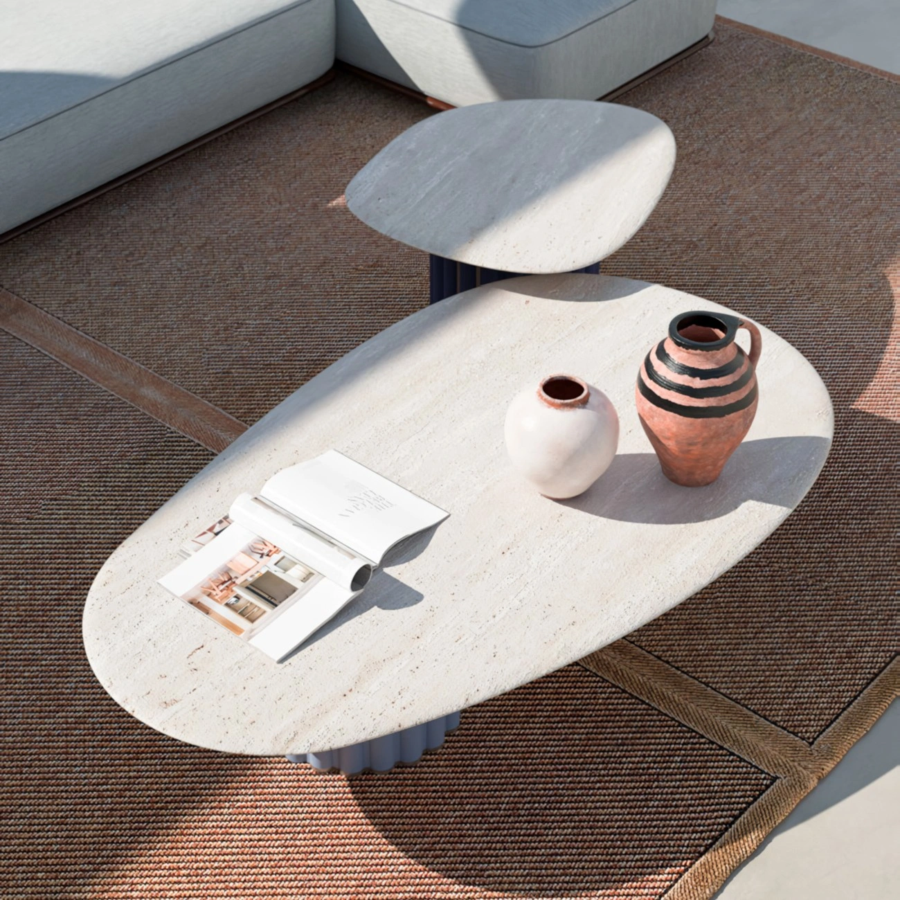
Color now has a functional role—psychological, even. Warm neutrals, soft greens, jewel tones—they invite lingering. Ochres and clay tones cradle furniture, textiles, light. Subtle complexity shows in pairing materials. Linen sofa against dusty green wall feels different than the same sofa against white. Terracotta pottery shifts tone in sunlight. Layers make a room alive, not just pretty.
Pantone is pushing designers to think about emotion over statement. Spaces are restorative, not just curated for the camera.
Layering Materials
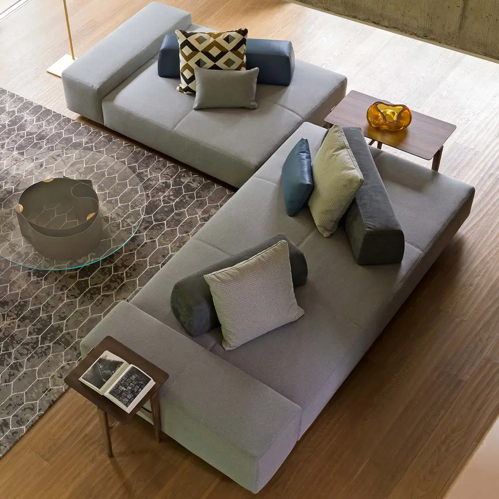
Warmth gains weight through texture. Jute rug under ochre sofa. Dusty teal pillow on rattan armchair. Terracotta on a wooden table. Materials and pigments talk to each other.
Light matters. Morning sun warms clay, afternoon shifts greens and jewel tones. Colors aren’t static—they respond to life. Interiors like this feel human, collected, and slightly imperfect.
Brands and the Market
Major paint brands echo the trend. Benjamin Moore, Sherwin-Williams, Valspar—all leaning into muted greens, grounded neutrals, soft jewel tones. It’s no accident. Consumers are investing in mood, in tactile experiences, in spaces that feel real.

Walls, upholstery, accents—they interact. A sage wall feels different next to a terracotta vase or deep teal chair. Layering matters more than a single “perfect shade.”
Depth Over Flash
Depth beats saturation. Soft jewel tones, warm neutrals, muted greens—they give context. Color interacts with furniture, light, texture. Rooms built this way feel human. Collected, not staged.
A dusty teal pillow can make a neutral living room feel intentional. Terracotta accents add warmth without shouting. Ochres and clay anchor space while leaving room for layering. Pantone isn’t selling a color, it’s selling a feeling.
Living With Pantone 2026 Color
The best interiors of 2026 feel tactile first. Mocha-toned walls invite touch. Dusty teal pillows beg to be used. Terracotta shifts in light. Colors don’t exist alone—they work with furniture, objects, and the people living there.
The focus is on experience. Layered, textured, restorative colors encourage lingering. They respond to sunlight, shadows, movement. Interiors feel alive. Not polished, not perfect, but intentional and human.

Subtle Complexity
Complexity doesn’t mean clutter. Sage walls, ochre sofa, deep teal chair—together they harmonize. Subtle shifts in tone and saturation create interest. Rooms feel intentional and restorative, not like a template.
Warmth, depth, subtlety—these replace the cool greys that dominated for too long. Interiors in 2026 feel flexible, lived-in, and alive. Pantone’s influence isn’t just color—it’s mood, depth, and humanity.