Muted jewel tones are quietly taking over interiors, without the usual fanfare. Deep teal, dusty emerald, midnight navy, earthy terracotta—colors that are rich, layered, but never shout. They have presence, but they’re easy to live with. They anchor rooms, bring depth, but don’t dominate the space the way bright primary tones can.
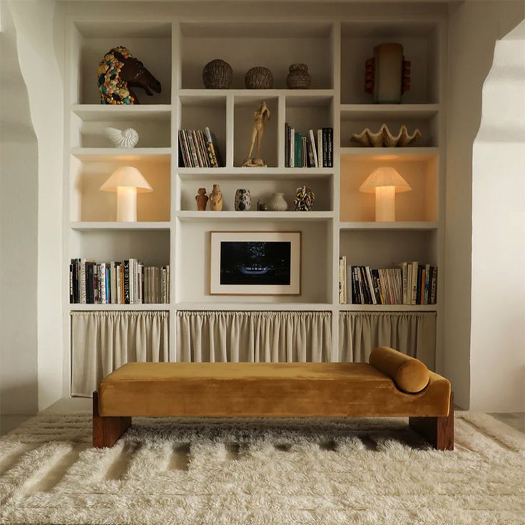
Feature walls still matter, but muted jewel tones make them feel considered. A deep teal wall isn’t just a backdrop; it gives the room a pulse. Terracotta in an alcove doesn’t just hold objects—it frames them. Dusty emerald cabinetry paired with rattan furniture quietly transforms a kitchen or bathroom from functional to intentional. These tones suggest someone lives here, someone with taste, not someone chasing a trend.

Depth Without Drama
One of the things about these colors is subtlety. Deep teal or midnight navy isn’t flashy, but it carries weight. Dusty emerald has warmth without being literal. Terracotta glows but doesn’t scream. They’re almost like the visual equivalent of good leather—rich, tactile, understated, and they improve with time.
A velvet teal chair changes color through the day. A terracotta vase warms under afternoon light. These aren’t just choices of paint—they’re experiences. And you notice them, even if only subconsciously. That’s what makes them feel alive rather than staged.
Layering Colors
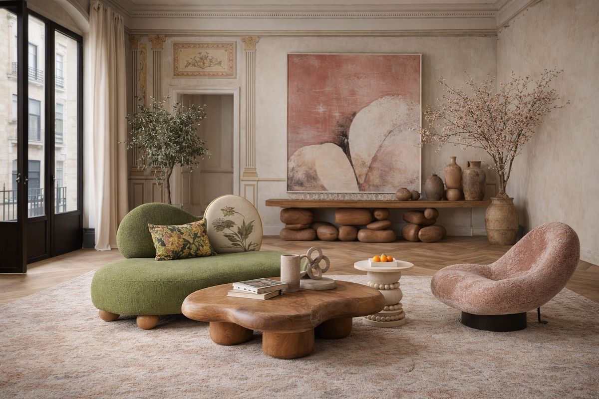
Muted jewel tones aren’t meant to exist alone. Terracotta walls beside a dusty emerald cabinet. Midnight navy bookcases under pale oak shelves. Deep teal alcoves framing brass accents. The eye moves from color to color without being jarred.
They layer without clutter. Unlike the stark minimalism of the last decade, these tones invite texture, human scale, life. Linen, wool, wood, rattan—they all play off these hues, creating depth that flat neutrals can’t. A single muted jewel tone is nice. Several, carefully considered, make a room sing.
Architecture as Canvas
Alcoves and niches feel different with these shades. Paint them deep teal or dusty emerald, and suddenly architecture matters. The space itself participates in the design. Cabinetry, too, gains weight. Midnight navy or terracotta cabinets aren’t just functional—they become part of the room’s narrative.
It’s intentional without being overdone. You don’t need to paint the whole room. Jewel tones define, punctuate, and elevate. The house feels collected rather than staged.

Emotional Resonance
These shades affect mood. Deep teal comforts. Dusty emerald soothes. Midnight navy grounds. Terracotta radiates warmth. Together or alone, they give rooms character. They aren’t about impressing visitors—they’re about inhabiting the space.
In 2026, interiors lean toward experience over spectacle. Muted jewel tones exemplify this. They encourage touch, interaction, lingering. Rooms feel alive, human, layered, and a little imperfect—because that’s how living happens.
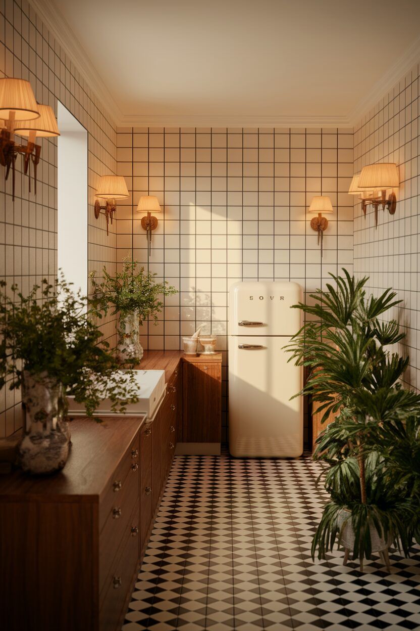
Pairing With Neutrals
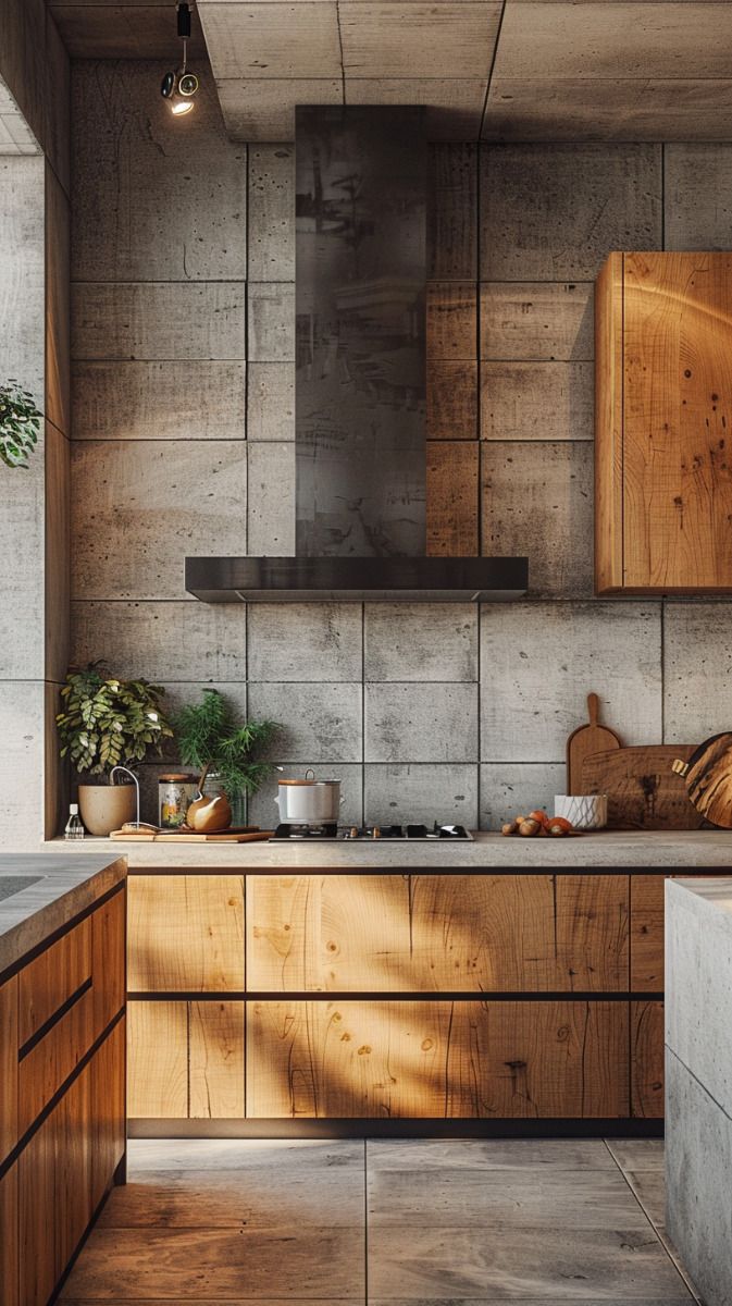
Muted jewel tones work best alongside grounding neutrals. Ochres, soft beiges, greys, off-whites. They let the color breathe. A terracotta alcove next to a linen sofa. A deep teal wall with warm wood flooring. Dusty emerald cabinetry softened by pale stone counters.
Neutrals are not a crutch. They elevate the jewel tones, creating space for the eye to rest. They keep the rooms from feeling heavy, letting colors feel intentional rather than overpowering.
References and History
Muted jewel tones feel collected, not trendy. They reference the past without being literal. Deep teal evokes old velvet lounges. Dusty emerald suggests vintage libraries. Midnight navy recalls painted cabinetry in grand, older homes. Terracotta carries the warmth of Mediterranean courtyards or handmade ceramics.
You feel the history without a textbook. They anchor modern furniture in something richer than trend. These colors reward observation—they’re not immediate or obvious, but linger in memory.
Texture and Materiality
Color alone doesn’t do it. Jewel tones gain life through texture. Velvet chairs, wooden cabinets, rattan baskets, stone surfaces—they all interact differently with the hues. A terracotta pot is warmer against an emerald wall. Midnight navy wood gleams differently depending on the light. These subtleties give rooms nuance.
Light, too, is part of the story. Morning, afternoon, evening—colors shift. That’s part of the appeal. These are living spaces, responding to life, not just staged for Instagram.
Subtle Complexity
Muted jewel tones thrive on nuance. Deep teal, dusty emerald, midnight navy, terracotta—they’re not single-note. They shift, layer, converse with each other. Alcoves, feature walls, cabinets—they all work together to create rhythm. Complexity, yes, but quiet. It doesn’t clutter. It doesn’t dominate. It invites attention, subtly.

Imperfectly Intentional
The magic is in imperfection. Walls aren’t perfectly flat. Cabinets have slight variations in sheen. Sunlight changes a room’s mood. The spaces feel alive. Human. Lived-in. Jewel tones give rooms sophistication without feeling calculated. They age well. They accommodate furniture, textiles, and human movement without needing constant tweaking.
They’re luxury without ostentation. They’re quiet richness.
Living With Muted Jewels
At the end of the day, these colors work because they feel real. Feature walls, alcoves, cabinets—they anchor interiors with depth and intention. They pair with texture, materials, and light to create a human experience.
Muted jewel tones are not for decoration alone—they’re for inhabiting, feeling, and living. Deep teal, dusty emerald, midnight navy, earthy terracotta—they bring warmth, depth, and complexity. Spaces feel alive, intentional, and just a little imperfect—the way homes should.