Creating a cohesive home color palette isn’t about limiting creativity—it’s about choosing colors with an awareness of how they relate to one another. You hold up a paint swatch, think you love it, get it on the wall, and suddenly wonder what went wrong. Or you pick a sofa you like and later realize it doesn’t get along with the rug, or the luxury poufs, or the wood tones in the room. These moments usually don’t mean your choices are “bad.” It just means the colors weren’t chosen together.
That’s where the idea of creating a cohesive home color palette becomes helpful. Instead of choosing colors separately and hoping for the best, you choose them with a sense of how they relate. A cohesive palette doesn’t force your home into one strict style. It doesn’t mean everything becomes beige or minimalist. What it does is give your home a sense of flow—from room to room and even within a single space.

What makes a home feel visually calm or put-together usually isn’t fancy decor; it’s color harmony. Even if you love bold shades, they look better when they have context. And even if you prefer neutrals, they look richer when they’re chosen with intention. This guide breaks things down into ideas that are easy to apply—no design degree, no special vocabulary, and no pressure to get everything perfect.
Think of it as a practical way to understand how color behaves, so you can use it with more confidence and less trial-and-error.
Start With the Mood You Want (Not a Paint Chip)
Before you look at a single color, take a moment to think about how you want your home to feel. This sounds simple, but it sets the tone for everything that follows. A calm, quiet home uses a different palette than one that feels bright and energizing. And a cozy, warm home pulls from different tones than one that feels light and airy.
Maybe you want the space to feel grounded and warm. Maybe you prefer something fresh and clean. Or maybe you like a slightly moodier, deeper aesthetic. When you identify the mood, you automatically narrow your choices—and that’s a good thing. It keeps you from picking colors you like individually but don’t actually want to live with every day.
Mood is the backbone of a cohesive home color palette. Once you define it, almost every decision becomes clearer. You’re not just choosing a color because it’s pretty—you’re choosing because it supports the atmosphere you want at home.
See Color the Way It Actually Works: In Context
One of the most confusing parts of home design is that color never works alone. You may fall in love with a muted green, only to find it looks totally different against your warm oak floors. Or a “clean white” can suddenly look dingy or yellow once it’s sitting next to the cool-toned stone in your kitchen.
Colors shift constantly because they reflect the light, the materials, and even the surrounding objects in your home. That’s why swatches in a store—or even photos online—aren’t enough on their own. The only reliable way to judge a color is to look at it in the actual room you’re designing.

Tape swatches to multiple walls, especially in corners, because that’s where light behaves differently. Check them in the morning, afternoon, and at night. Hold them next to your furniture, floors, and trim. Even your hardware finish—like brass or matte black—can affect how a color reads.
Understanding these interactions is a huge part of building a cohesive home color palette, because cohesion comes from relationships. Once you see how colors influence each other, you start making choices that naturally align.
Get Comfortable with Undertones (They Matter More Than You Think)
You don’t have to memorize color theory, but understanding undertones will save you from so many headaches. Every color has a masstone (what you see at first glance) and an undertone (a subtle tint underneath). A beige might lean yellow or pink. A grey might lean blue or green. Even whites have undertones—some warm, some cool.
Why does this matter? Because undertones determine whether colors blend or clash. A warm beige wall with a cool grey sofa might always feel slightly off, even if both colors looked great individually. If your trim has a warm undertone and your chosen white paint is cool, the trim will suddenly look outdated or “dirty.”
When choosing colors, compare swatches side-by-side. The undertone becomes obvious when you place one color next to another. Aligning undertones gives your home a subtle but powerful sense of unity. It’s one of the most effective ways to make a cohesive home color palette without restricting yourself.
Build the Palette in Layers, Not All at Once
Creating a color palette works best when you build it step by step. Start with your main neutral—the color or material that appears most in your home. This could be paint, flooring, cabinetry, or even a large piece of furniture. Then choose a secondary neutral that balances it.
After that, pick one or two accent colors you naturally enjoy. They don’t have to be bold; even soft, earthy accents count. These accents can show up in smaller places like pillows, rugs, art, or even light fixtures.
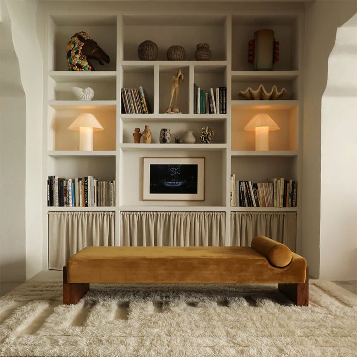
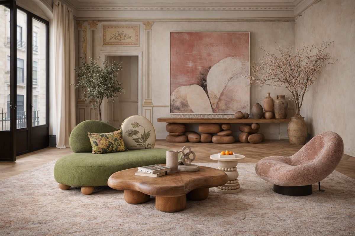
What surprises most people is how far a small number of colors can go. A well-planned palette doesn’t need twelve colors. Four or five can often carry an entire home, especially if they share undertones or come from the same family. Repeating these colors in different rooms creates flow without feeling repetitive.

This slow-build method creates a cohesive home color palette because you’re making decisions in relation to what you’ve already chosen—not starting fresh every time.
Consider Whether Your Colors Are Muted or Clear
It also helps to notice whether colors are muted or clear. Muted colors have a bit of grey or brown mixed in, making them softer or dustier. Clear colors look bright, crisp, and more pure. Neither is right or wrong, but mixing them without intention can create visual tension.
For example, a room decorated with muted sage, soft grey, and warm beige might feel disrupted by a bright turquoise pillow. On the flip side, a crisp, fresh room filled with bright whites and clear blues might look weighed down by a muddy terracotta.
You don’t need to choose only muted or only clear colors, but it helps to know which category will lead. In most homes, one group dominates while the other appears in supporting roles. This subtle awareness keeps your cohesive home color palette feeling natural and not forced.
Warm and Cool Tones Can Coexist—Just Balance Them
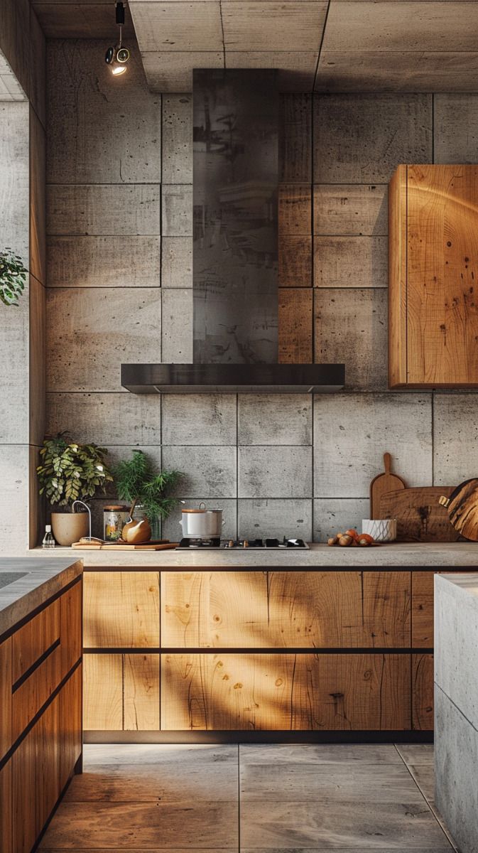
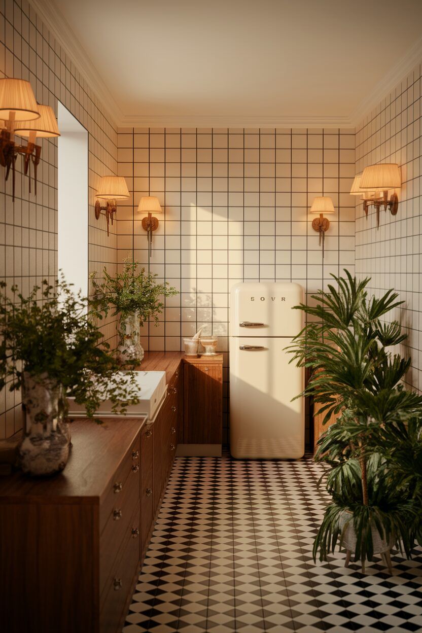
There’s a lingering myth that warm and cool tones shouldn’t mix. In reality, they mix beautifully when handled thoughtfully. A warm oak dresser against a cool grey wall can create depth. A cool blue sofa with warm brass accents can feel both soft and sophisticated.
The key is proportion. Let one temperature dominate and the other complement. If your home has mostly warm elements—tan leather, warm woods, beige walls—add a few cool accents to keep things from feeling too heavy. If your home is mostly cool—purity whites, greys, blues—you can warm it up with earthy colors, warm metals, or creamy textiles.

This blend often creates a richer, more layered look. And it helps maintain a cohesive home color palette because you’re balancing temperatures instead of letting one overpower the entire space.
Lighting Will Change Everything (Sometimes Dramatically)
Light is one of the biggest influences on color. Natural light changes throughout the day, and the direction your room faces affects tone too. North-facing rooms often make colors look cooler. South-facing rooms warm everything up. East-facing rooms shift quickly during the morning, while west-facing rooms glow in the afternoon.
Artificial light also matters. Warm bulbs add a golden glow; cool bulbs give a bluish tint. LED bulbs have their own quirks too—some make colors look flatter, others exaggerate undertones.
This is why a paint color that looks perfect online might look completely different on your walls. The paint didn’t change; the lighting did.
A truly cohesive home color palette accounts for this. Test colors in the space where they’ll live. If you can, paint a larger sample—at least a square foot or two—and check it in every kind of light your room receives. Stability across lighting conditions is a good sign you’ve found the right shade.
Let Rooms Connect Without Matching Exactly
Cohesion doesn’t mean uniformity. It means things relate. Repeating colors—either subtly or clearly—creates a sense of flow as you move through your home.
That could mean using the same neutral wall color throughout the main areas. Or it could mean using different shades of the same hue: deeper in one room, lighter in another. You might use a muted green throw in the living room and bring that same green into the kitchen through artwork or a small decor piece.
Even if the rooms look different, they feel connected. This is what a cohesive home color palette does: it ties everything together without making the home feel overly coordinated.
Final Thoughts
Color is one of the simplest ways to transform your home, yet it’s often the part people struggle with most. The good news is you don’t need formulas or strict rules. You just need awareness—of mood, lighting, undertones, relationships, and balance.
A cohesive home color palette isn’t about making your home look “designed.” It’s about creating comfort and consistency. It’s about walking from one room to another without feeling like you’ve stepped into a completely different world. It’s about letting every color you choose support the experience you want your home to offer.