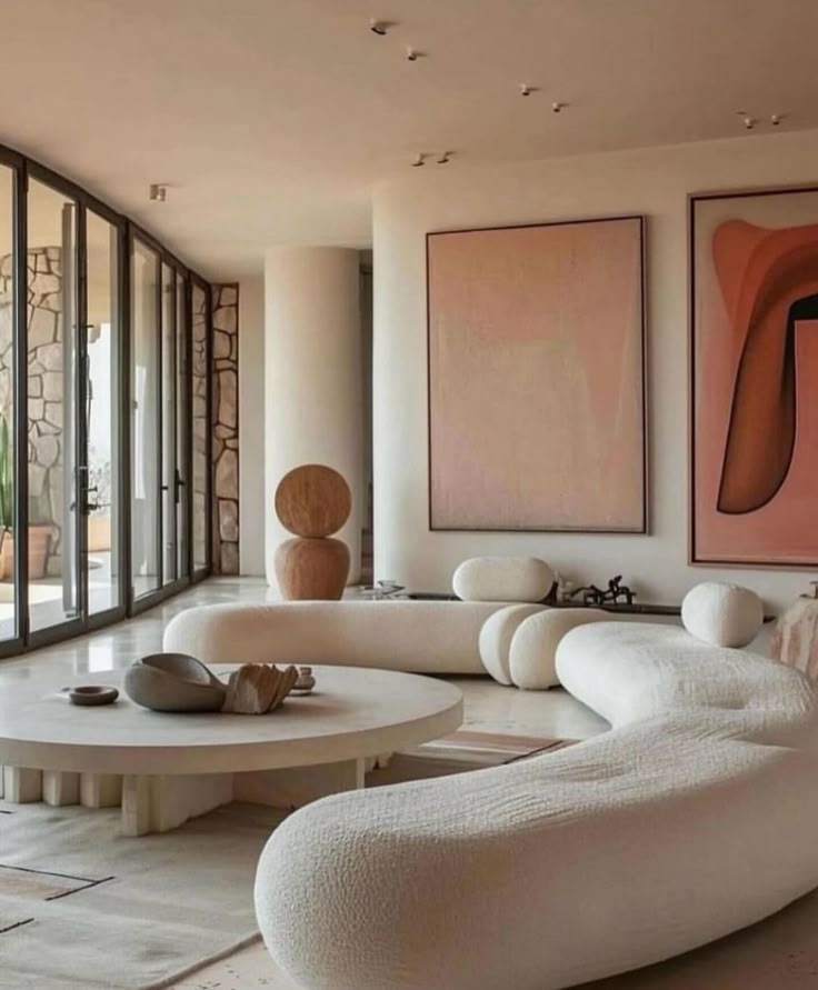
Rooms painted in atmospheric color don’t announce themselves. They arrive softly, like a low hum, and only later does the full effect register: walls, textiles, custom furniture, and finishes woven into a single tonal fabric. The effect isn’t about bravado; it’s about enclosure, a subtle insistence that the body and mind slow down. A bedroom in muted terracotta, where the dresser blends into the floor and the rug picks up just the faintest undertone of the curtains, can feel like a room exhaling. It’s the opposite of contrast-driven drama, yet it carries its own kind of insistence: pay attention, even if you barely notice why.

Variation Without Obvious Design
The appeal lies in variation, but not the obvious kind. There’s a quiet rebellion here against rigidly matching palettes. A cushion may be almost—but not quite—the same hue as the wall; a cabinet may shift a shade lighter than the trim. Patterns exist, but sparingly, almost as punctuation marks rather than statements. The eye moves across the room without jarring stops, yet notices depth and texture where monochrome flatness might feel sterile. It is deliberate, controlled, but never mechanical.
Annie Downing of Annie Downing Interiors puts it succinctly: “Color is always about atmosphere first. The goal isn’t to make a statement—it’s about creating a sense of envelopment that quiets the room and slows you down.” The statement is not in the pigment itself, but in the psychological sway it exerts, subtle enough to register only in how the body inhabits the space.
The Challenge of Subtlety
Subtlety is deceptive. A chromatic atmosphere can collapse into blandness with a single misstep. Too much similarity between elements, and the room reads as unfinished; too much contrast, and the intended calm fractures into visual tension. The difference between success and failure often comes down to texture: a matte plaster wall against a softly napped linen sofa, a burnished wood floor under a hand-dyed rug. The eye senses variation even when color appears uniform.
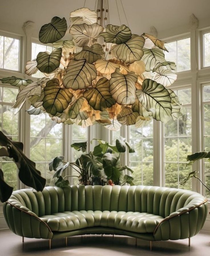
Lighting, too, plays a decisive role. Warm morning sun can transform a muted olive wall into a greenish-gold haze; the same wall under tungsten bulbs may read nearly brown. Chromatic atmospheres demand an understanding that color is never fixed, never isolated. Each material, finish, and light source is a brushstroke contributing to a larger, living painting.
Interiors as Emotional Topography
These spaces are less about visual hierarchy and more about emotional contouring. A study in foggy mauve or storm-gray doesn’t direct the gaze; it moves the body. The subtle shift of tones across a room creates a sense of depth, as if the walls themselves were breathing. A home office in layered blue-grays may feel sharper, more focused, while a living room in amber and clay can quiet movement and conversation without commanding either. The color is never didactic—it is empathetic.
What differentiates atmospheric color from older notions of tonality is that it thrives on nuance. A room doesn’t need an accent wall to register interest; interest is in the gradation, the way a chair’s upholstery echoes a shadow on the wall, the way textiles suggest light rather than reflect it. It’s a design language that rewards observation rather than lecturing.
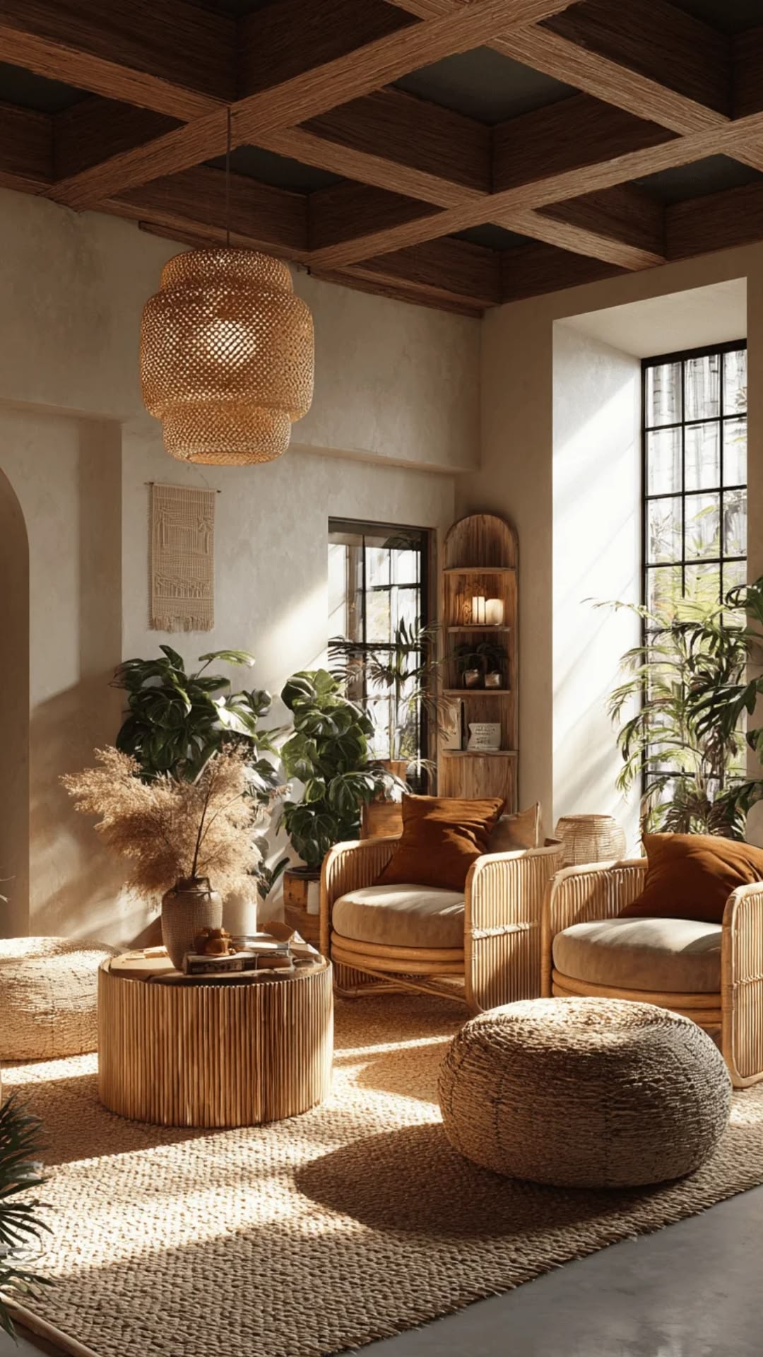
Materiality as Messenger
Paint is merely the starting point. Plaster, velvet, brushed metal, handwoven textiles—these amplify or soften the chosen tones. A silk throw can read differently from a wool blanket of nearly the same color. A lacquered surface may catch light in a way a matte surface never will, introducing imperceptible variations that disrupt uniformity without breaking the mood. These rooms are, in essence, compositions of subtle conflict, harmonized to seem effortless.
There’s also a paradox in the trend: it feels modern, but not because it embraces minimalism or stark geometry. It’s modern because it assumes confidence in restraint, in leaving the room alone enough to let light and texture carry meaning. The calmness is intentional; the quiet is designed.
Misreading the Trend
A common misstep is treating chromatic atmospheres as a color-matching exercise. Cabinets, rugs, and walls are not meant to merge into a single monolith. They should speak in the same dialect, but with inflections and cadences that reveal spatial richness. Another pitfall: misunderstanding the emotional dimension. These aren’t neutral backgrounds; they are spaces that ask for an inward turn, that suggest stillness without declaring it. To miss this is to mistake subtlety for blandness.

Slow Observation
The work of living in an atmospheric color interior is itself subtle. One notices a shadow on the wall at different times of day, the faint echo of color in the weave of a rug, the temperature shift in a paint that leans warmer under the afternoon sun. The room asks the inhabitant to slow down, to attend not only to objects but to the way perception itself changes within the space. It’s a form of design literacy that rewards patience.
These interiors feel like an exploration of potential energy rather than kinetic excitement. There is a latent drama, not in contrast or bold gesture, but in expectation: a sense that the space knows more than it is saying at any moment. The work is in the accumulation of details that nearly escape notice, in the interplay of tone and texture that never quite repeats itself.
The Risk and the Reward
Atmospheric color interiors carry risk. Too little variation, and the space feels inert. Too much, and the intended calm fractures. But when it works, it does more than decorate; it alters perception. A muted ochre living room can make a restless family feel oddly grounded. A soft, layered gray home office can make long stretches of work feel lighter, as though the walls themselves have absorbed the tension. The design succeeds not in drawing attention but in guiding it gently, almost subliminally.
The trend’s momentum suggests that designers are seeking refuge from spectacle. Chromatic atmospheres aren’t about impressing visitors—they’re about shaping the lived experience. It is a quiet assertion that interiors can carry emotional weight without relying on explicit narrative. The paint, the textiles, the finishes—they are instruments in a symphony where the listener is the inhabitant.

Spaces in Flux
There is an ephemeral quality to these interiors. A sunbeam across a mauve wall, a shadow lengthening over a terracotta tile, a breeze shifting curtains—they all contribute to the color story, which is never static. Chromatic atmospheres embrace this impermanence, knowing that what feels calming at one hour may feel invigorating at another. This is less a trend than a philosophy: spaces as mutable emotional topographies, capable of subtle transformation without intervention.
It is a difficult balance to maintain, but perhaps that is the point. The atmospheric color interior is an exercise in observation, in restraint, in patience. It is not a statement shouted, but a presence felt. It resists neat conclusion, refuses tidy lists, and asks for a closer look, over time.