


Natural materials have a quiet confidence. Rattan, oak, walnut, wicker furniture—they’ve been around forever and yet never feel dated. Partly it’s nostalgia, partly it’s just how they feel to the hand and the eye. They have warmth. They have texture. They respond to light in ways that synthetic finishes don’t. They age gracefully. And now, in 2026, the 2026 color report shows how color is finally catching up to natural materials. The palettes aren’t loud, not gimmicky. They’re more like a conversation, colors that want to talk to the materials rather than compete with them.
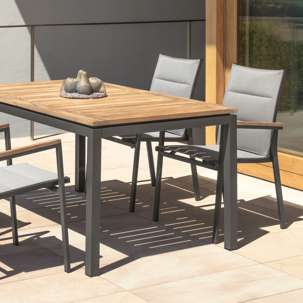
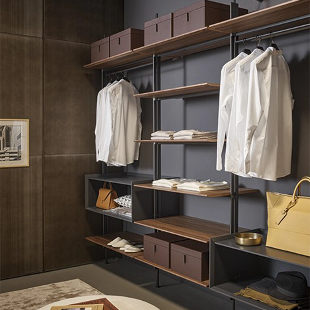
Wicker and wood set the baseline. Their tones are inherently warm, earthy, and textured. The challenge is layering color in a way that feels fresh but doesn’t fight the natural richness. Many people stick to safe neutrals—creams, grays, soft taupes. Fine, that works. But 2026 color report is about subtle risk. Bold accents, mid-tones, hints of unexpected shades that lift a space without making it feel busy.

Jewel Tones with Restraint
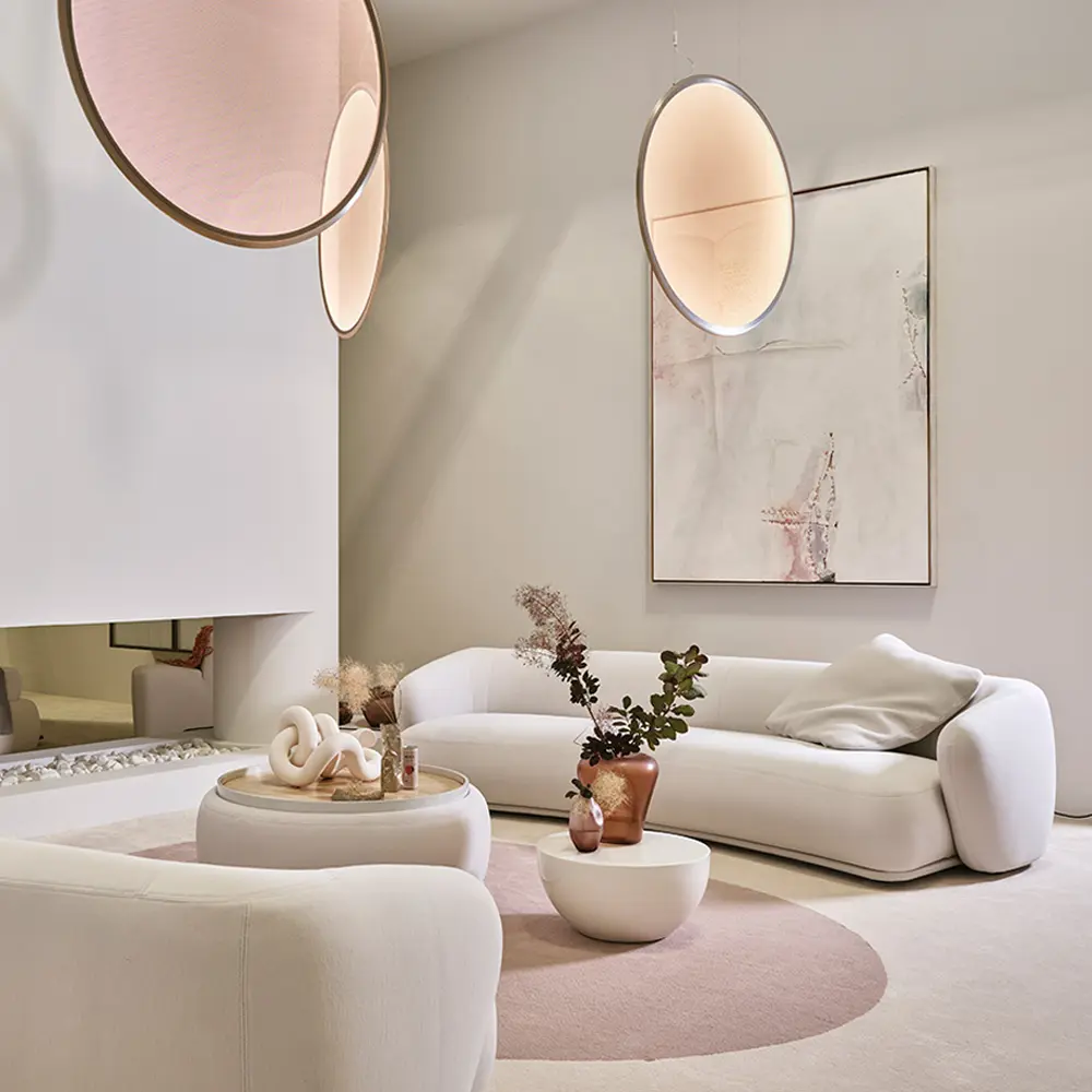
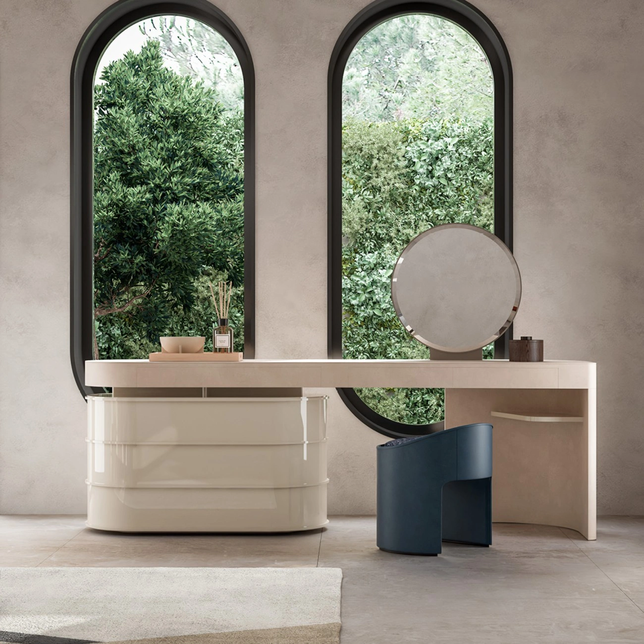
Jewel tones are showing up in surprising ways this year. Emerald, sapphire, deep amethyst, topaz—not overpowering, just enough to give the room energy. The key is restraint. A sapphire chair in the corner, a rich ruby throw draped casually over a wicker chair. Suddenly the eye moves between color and texture, noticing both.
Velvet, leather, even matte fabrics are ideal for these hues—they soften the intensity and layer nicely with natural fibers. A bright color can feel buoyant when paired with airy textures. It’s a subtle shift but it changes the energy of the whole room.
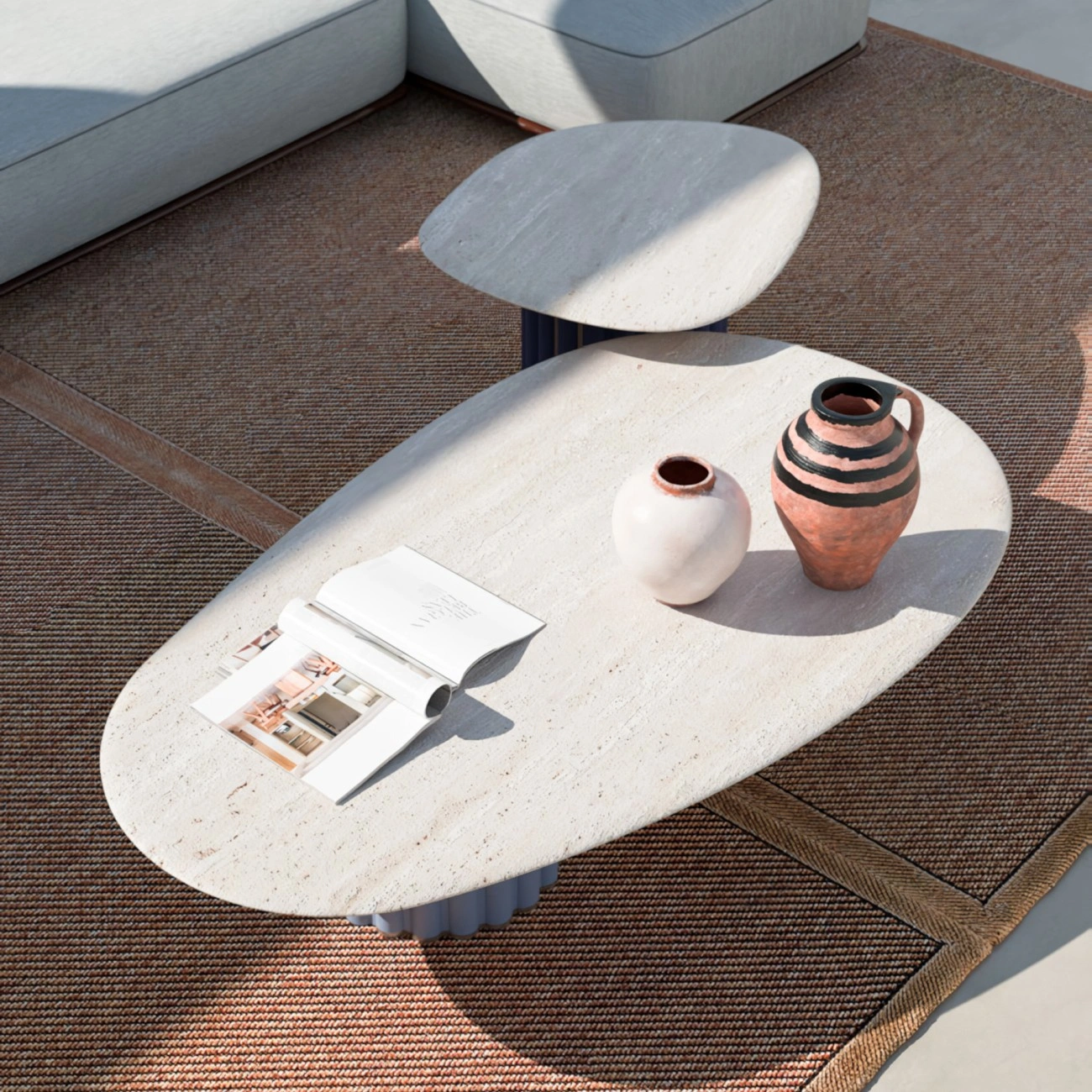
Terracotta and Clay
For a more muted approach, terracotta and clay shades are perfect. They live in the same tonal family as wood and wicker, so layering feels effortless. A clay-colored throw on a wicker chair, a rust vase on a walnut sideboard. It’s quiet, grounded, and feels natural.
These colors age well, too. They shift with the light and complement the textures around them. Designers are pairing them with mid-century forms and Scandinavian touches alike, balancing warmth with sophistication.

Pastels, Soft but Not Sweet
Soft pastels are back too, but the trick is nuance. Misty blue, sage, blush, butter yellow—they’re low-saturation, thoughtful. They provide contrast without screaming. A pale blush rug, a misty blue wall behind a rattan daybed. It all feels lighter, airier, and modern.
Pastels play particularly well with lighter woods—ash, maple—giving a room freshness while letting texture stay central. They feel calm, approachable, and adult, unlike the candy-colored pastels of earlier decades.
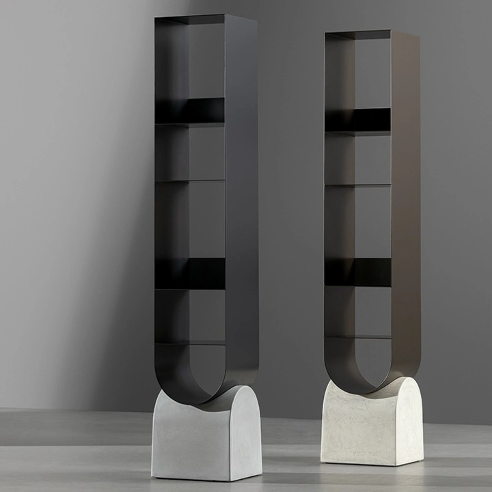
Earthy Depth
Earth tones—charcoal, deep olive, cocoa—are also trending. Paired with wicker or walnut, they add drama without being theatrical. Dark walls behind a rattan console table or a wooden shelf give depth, letting natural materials really pop.
These colors also make the textures shine. The weave of a chair, the grain of a table—they’re highlighted, not overwhelmed. A little drama, a little contrast, but it feels effortless rather than forced.
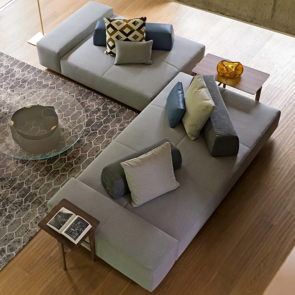
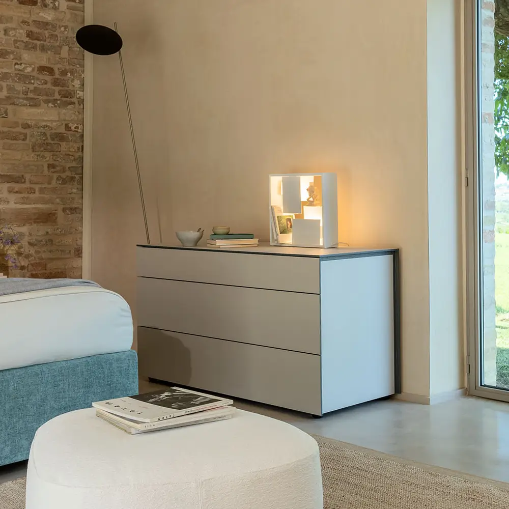
Neutrals Still Matter
Neutrals haven’t gone anywhere—they’re still the glue. Linen, sand, cream, taupe. But in 2026, they’re layered and textured. Cream walls, a soft linen sofa, a warm stone rug, and a sage accent pillow. That layering makes color accents sing without chaos.
Textures are key. Matte plaster, sisal rugs, raw linen drapes. These neutral textures keep a room dynamic. Wicker and wood always benefit from this approach—otherwise the space can feel flat or staged.
Small Pops Make a Difference
Tiny pops of color go a long way. A jewel-toned vase, a burnt orange throw, a single bold pillow. The natural fibers of wicker and wood absorb and support them.
Placement matters. The accent should feel deliberate. A cobalt vase on a rattan table, a tangerine throw on a walnut bench. It’s punctuation, not decoration. The room breathes around these pops.
Matching Material and Color
Not every hue works with every finish. Oak, teak, ash—they all read differently with pigments. Jewel tones can feel heavy on dark walnut but luminous on light oak. Pastels can fade against darker wicker.
2026 is about experimentation. Designers are pairing unexpected colors with natural materials intelligently. Wicker works almost everywhere, thanks to texture. Wood needs thought, matching undertones for harmony.

Practical Applications
In practice, this palette works anywhere: living rooms, bedrooms, kitchens, even terraces. A rattan dining set against pale sage walls. A walnut sideboard with charcoal behind it. A wicker lounge chair with a tangerine throw. Everything interacts, layers, and breathes.
Color should support materials, not compete. The furniture remains central. Hues are accents, energy boosters, depth providers. Spaces feel intentional, balanced, elevated.
Light Changes Everything
Color shifts with light. Jewel tones deepen in evening shadow, pastels glow in morning sun, earthy shades fluctuate throughout the day. Wicker and wood respond, too, glowing or darkening depending on light.
Designers are thinking about rooms in motion now. The space feels alive, not static. Color and texture interact, creating a room that responds to the day and season.
Layering for Depth
Layering is the secret. Not just materials, not just textures, but colors too. A terracotta pillow on a rattan armchair against an olive wall. A jewel-toned vase on a walnut shelf with a neutral rug beneath. Depth without clutter.
It’s intuitive rather than strict. Let materials guide color. Let color enhance texture. The room feels alive but composed. Sophisticated, not staged.
The 2026 Takeaway
Natural materials like wicker and wood are timeless, forgiving, and tactile. 2026 colors enhance those qualities rather than fight them. Jewel tones, earthy shades, muted terracotta, soft pastels, layered neutrals—they all work.
The focus is contrast without conflict, depth without clutter. Materials anchor the space, colors punctuate it. The result is elevated, modern, and alive—a room that feels curated, not forced.
Wicker and wood will always work. Now they have a palette that finally respects them, makes them shine, and gives them contemporary relevance.